Posts

Evaluation 1 - In what ways does your media product use, develop or challenge forms and conventions of real media products?

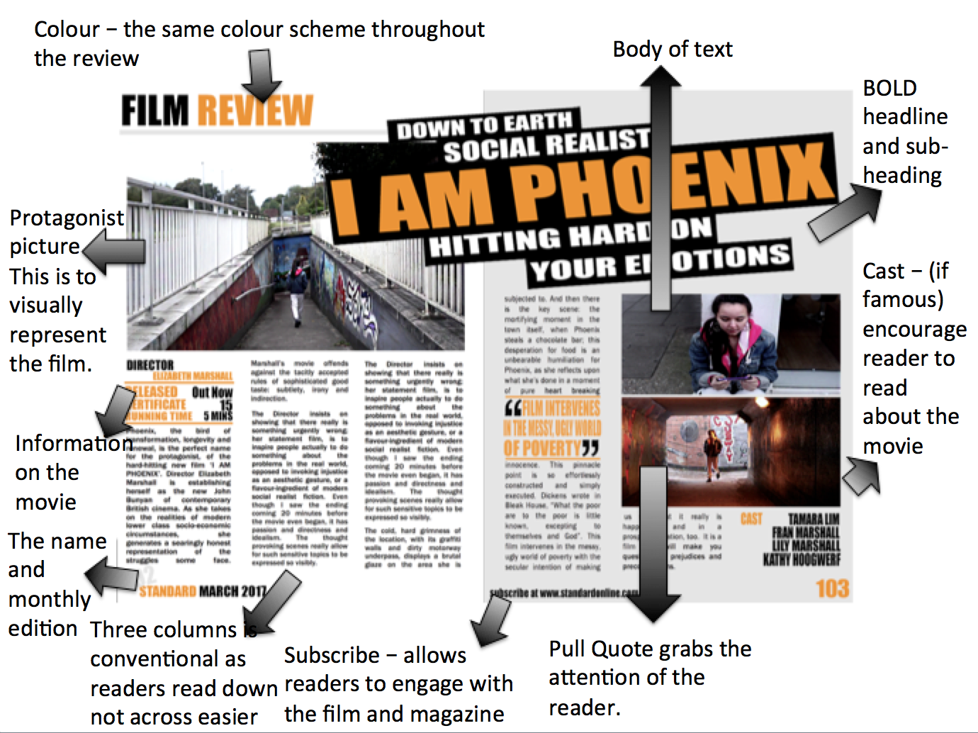
Created using Visme . The Free Online Presentation Tool. Transcript: In what ways does your media product use, develop or challenge forms and conventions of real media products? For my short film, I chose a social realist inspired by films directors such as Ken Loach, Andrea Arnold. I watched a range of films, including many from the Short Of The Week website, to glean information for my own production. In terms of camera work, I was inspired by shots in films such as ‘Fish Tank’, ‘I, Daniel Blake’, ‘ Augusta, Gone’ and also music videos such as Hozier’s ‘Take Me To Church’ and Sia’s ‘Chandelier’ as my film is about a dancer. In the social realist genre, editing tends to focus very much on continuity and creating verisimilitude through long-held shots, often stabilized hand-held shots, sometimes similar to a documentary style. Therefore I emulated these techniques in my own work. For social realism, it was vital that I established a credible mise-en-scene with costum

Evaluation 2 - How effective is the combination of your main product and ancillary texts?

Image
How effective is the combination of your main product and ancillary texts?

Evaluation 3 - What have you learnt from audience feedback?

Image
Audience feedback has been crucial to the overall effectiveness of my short film. Throughout the whole process I have adapted and changed my ideas from what my audience had to say. In order to receive the most effective feedback I targeted an audience of the same age range and demographic that I was aiming my film at, which was males and females between 16 - 29. Pre-Production My first major part of audience feedback was during the planning stages of my film, where I was able to skype with a professional film director. He first suggested to always be filming, and catch the mistakes made on set. This allowed me to watch inspirational movies and appreciate the shots that were not meant to be. Furthermore, Terry Hall also contributed feedback to my idea about effortless filming her dancing from multiple angles. He suggested using Match on Action shots, and to film her hundreds of times. For Example, I watched 'Take Me To Church - Sergei Polunin" - Where they have captured h

Evaluation 4 - How did you use media technologies in the construction and research, planning and evaluation stages?

For my Advanced Portfolio I made a short film in the social realist genre . I've learned a host of new skills relating to digital technology which helped me create a very successful media product, along with synergous ancillary tasks – a film poster and a magazine review. At A2 I was much more comfortable with using a wide range of digital technology and so was able to incorporate more advanced ideas into my research and planning. I also acquired a new Canon 5D camera to better the quality of my shots. So for this task, I created two ancillary tasks of a website and a film poster . This meant researching existing magazine review pages from magazines such as, Empire Magazine and film posters from Movies such as Fish Tank. After analyzing them, as well as watching YouTube videos to help me learn about the different software I was using: photoshop elements 11. I generated a poster and a magazine advertisement to develop my skills in using the software. I used my own pictures from

Social Realist Opening Credits

Image
There are many conventions surrounding the genre of social realism. I thought I’d best be aware of them if I’m to make a social realism film! In my opinion, titles are perhaps the aspect of social realism which is easy to find conventions for. Other conventions rely heavily on content and context of the film. So let’s start with titles. Font The font of social realism is nearly always sans serif. Social realism deals with the working class, and a serif font would be far too professional and middle class. Serif fonts are also usually used because it looks like less effort has gone into it, and laziness is a stereotype of the working class, especially in films. Some films will take this a step further, and add their own style to a sans serif font. For example, ‘This is England’ has titles which are made to look like graffiti, an issue which is shown in the film. This also matches the stereotype that the lower classes take part in vandalism. Positioning The positioning of titles

Rough Cut

Image
So here is the first rough cut of my movie At the moment, It is missing it's final scene and also the colouring off the dance sequence is a bit off. Therefore, It is not quite finished yet.